UI/UX case study · Figma · 2026
NutriPlanner
Healthy eating, planned in minutes. I took my rough university prototype and rebuilt it into a complete product: a documented design system, 17 screens and a clickable prototype.
The 60-second story of the redesign. Sound on.
01 · The problem
“What’s for dinner?” is a question we ask every day.
Planning healthy meals takes time: choosing recipes that fit your diet, checking calories and protein, then turning it all into a shopping list.
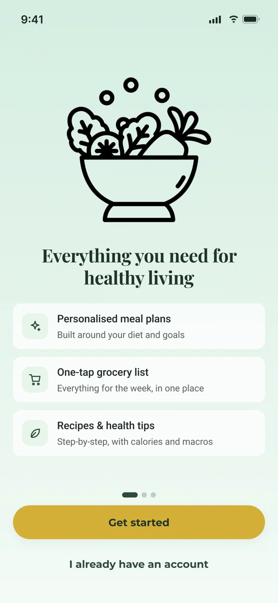
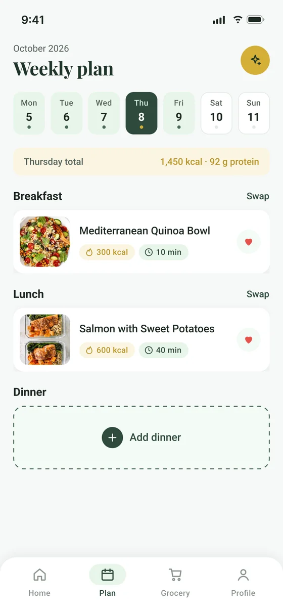
NutriPlanner plans the week around your diet, allergies and calorie goal, shows the macros for every recipe, and turns the whole week into a grocery list in one tap.
02 · Where it started
A university prototype with rough edges.
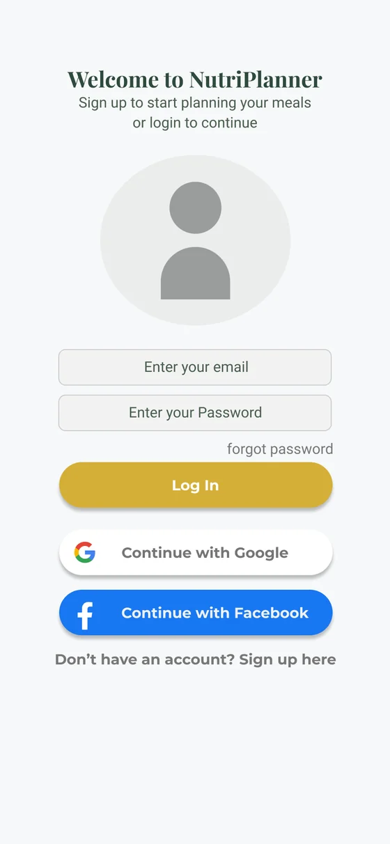
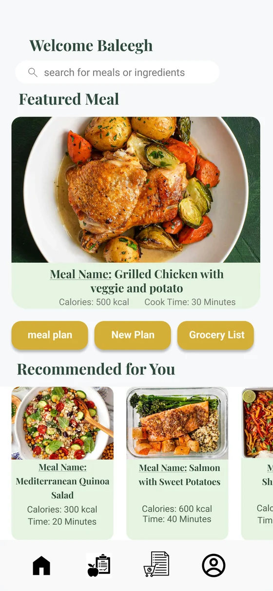
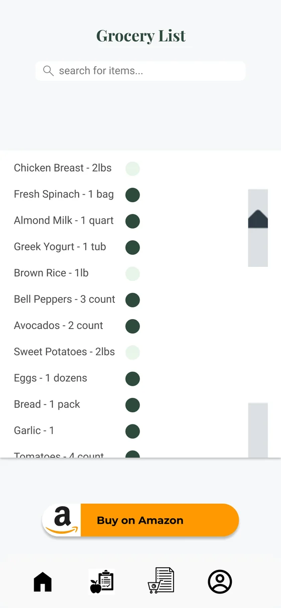
- 2.1 : 1White text on gold buttons. Far below the 4.5 : 1 that WCAG asks for.
- Image iconsNavigation icons pasted in as pictures: blurry, inconsistent, impossible to recolour.
- Uneven spacingNo grid or spacing scale, so every screen felt slightly different.
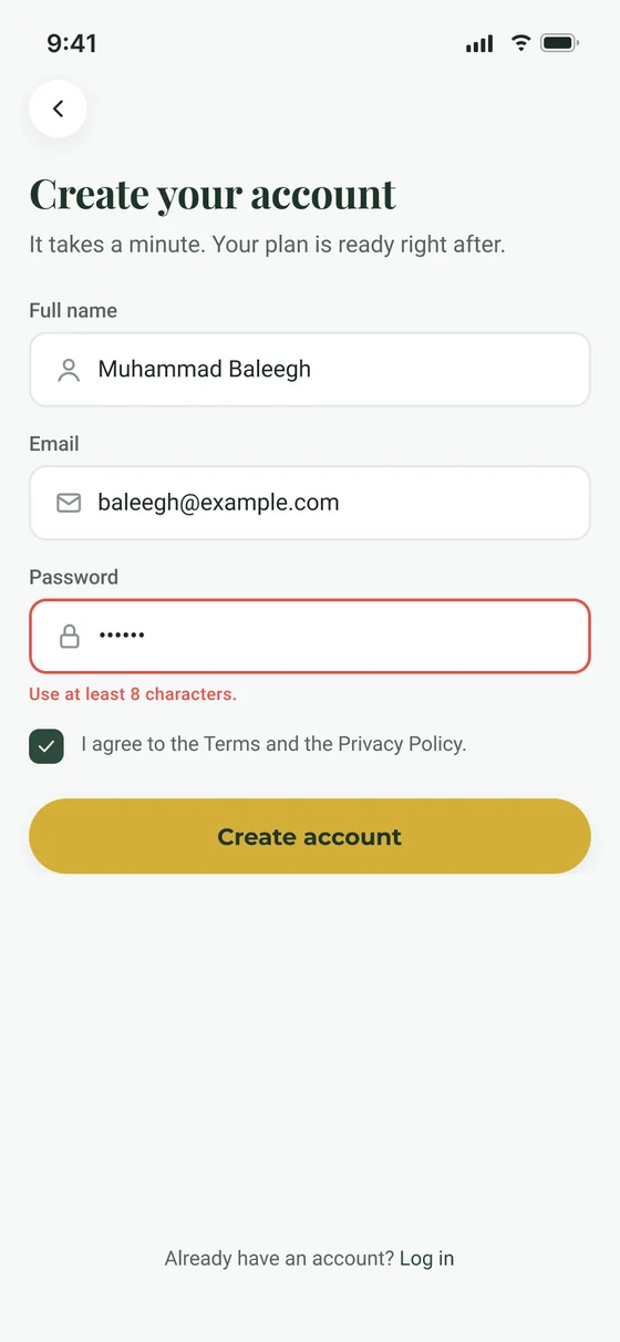
- Missing stepsNo sign-up and no preferences, although the whole idea depends on knowing your diet.
03 · The rebuild
Same idea. Now properly designed.
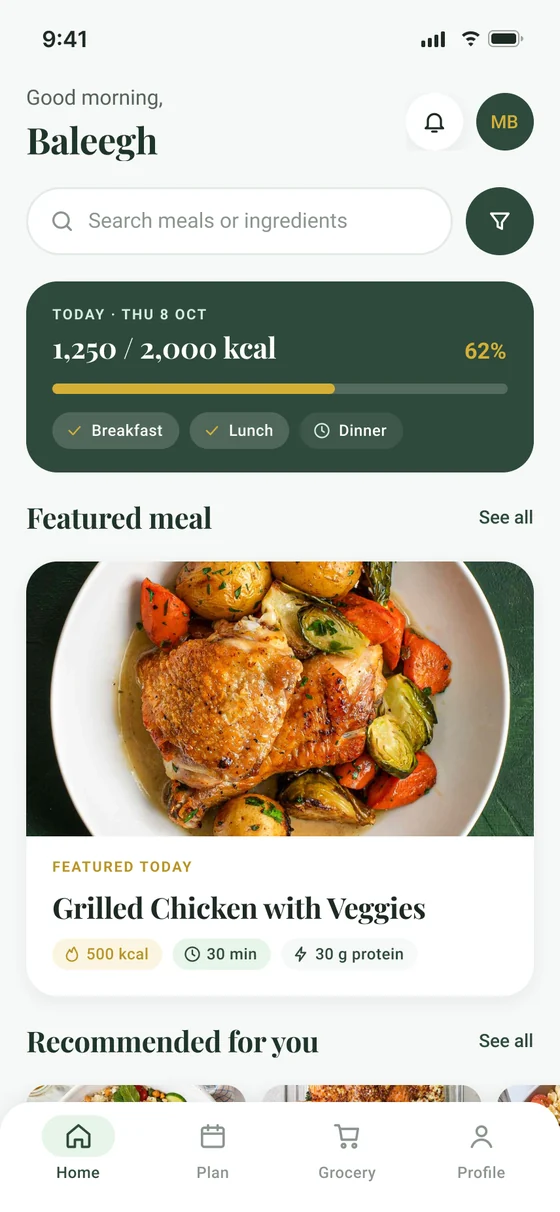
Drag the handle to compare the original home screen with the redesign.
- Readable actions. Gold buttons now carry forest-green text: 6.2 : 1, which passes WCAG AA.
- A real icon set. 31 vector icons on one 24 px grid, recoloured through variables.
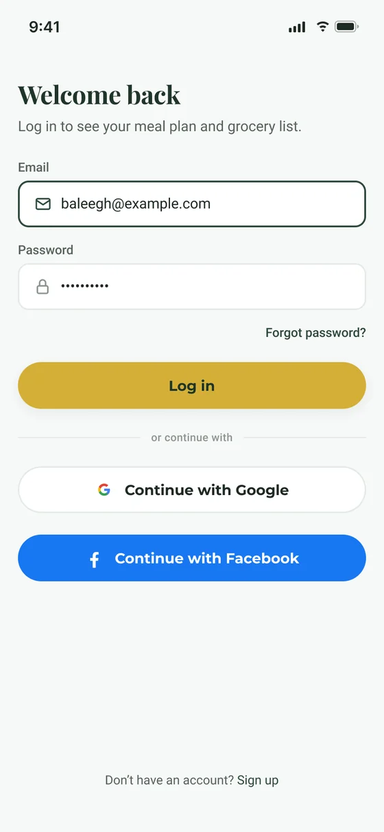
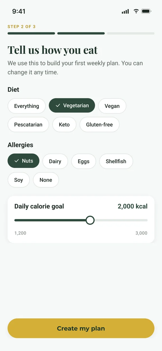
- The missing flow. Sign-up and a preferences step (diet, allergies, calorie goal) before the first plan.
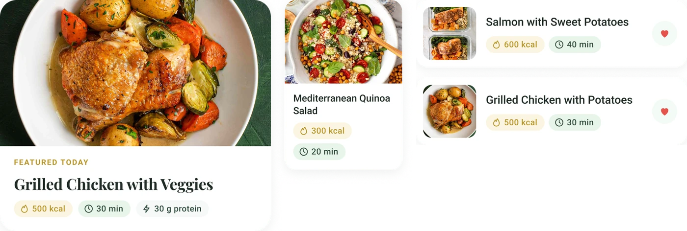
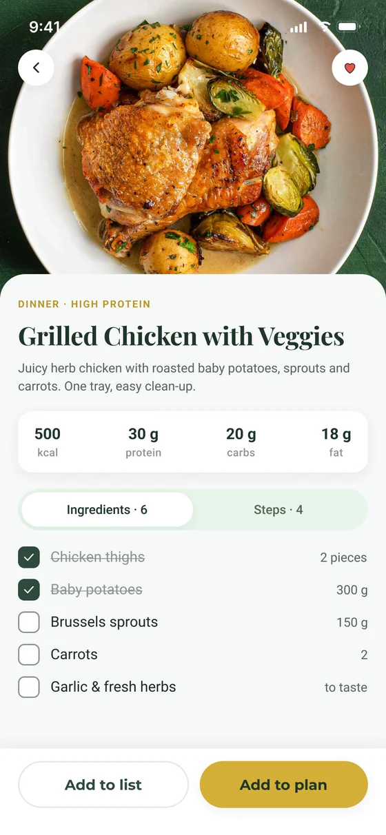
- Real content. Meal cards with photos, calories, time and protein instead of “Meal Name:” labels.
 BeforeAfter
Button contrast
04 · The design system
One system behind every screen.
Every colour, radius and spacing value is a Figma variable, so the whole app can be re-themed from one place. Components use auto-layout and variants, so screens are assembled, not drawn.
- 33design tokens
- 11text styles
- 13components with variants
- 31vector icons
Aa
Playfair DisplayHeadings. Warm and editorial.
Aa
RobotoBody text and numbers. Easy to read.



05 · The screens
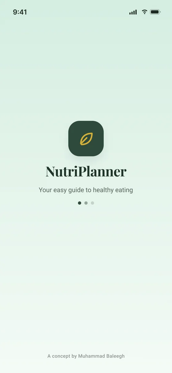
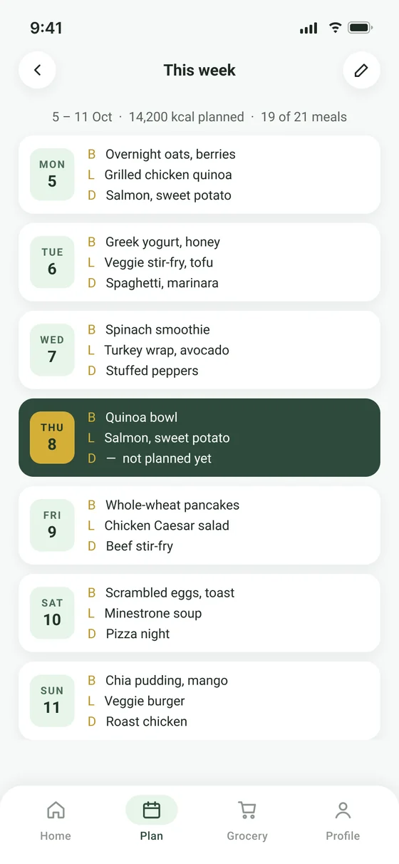
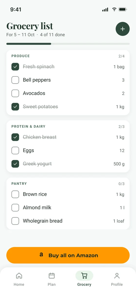
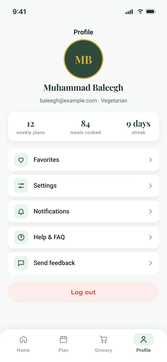
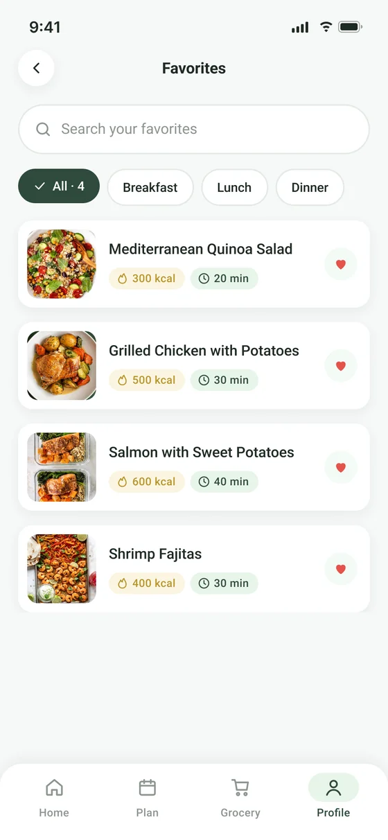
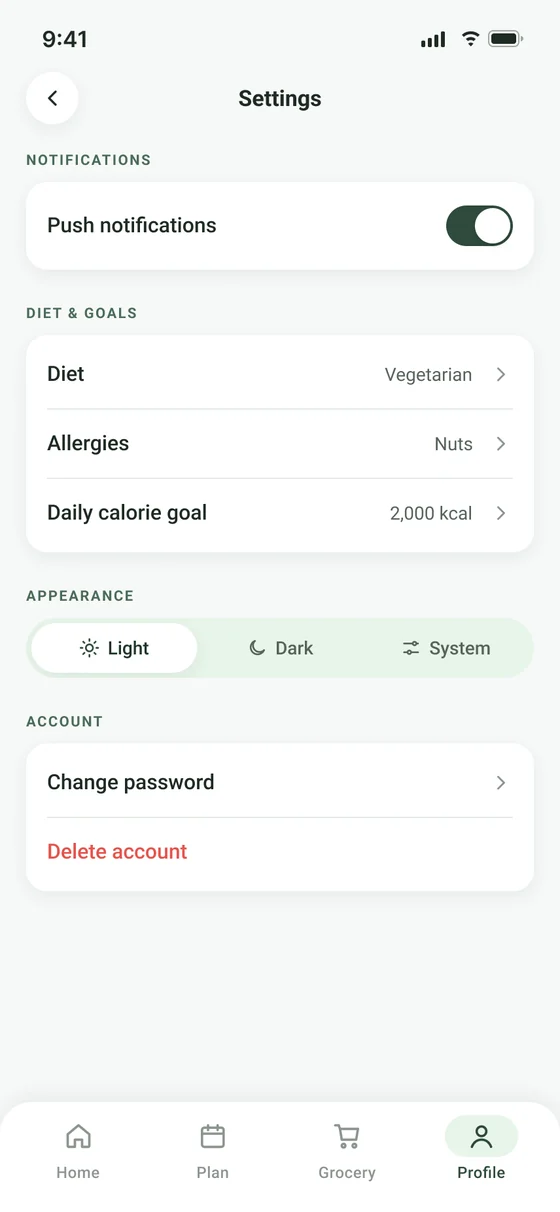
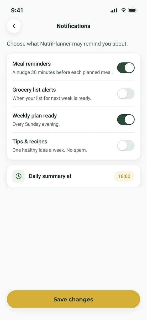
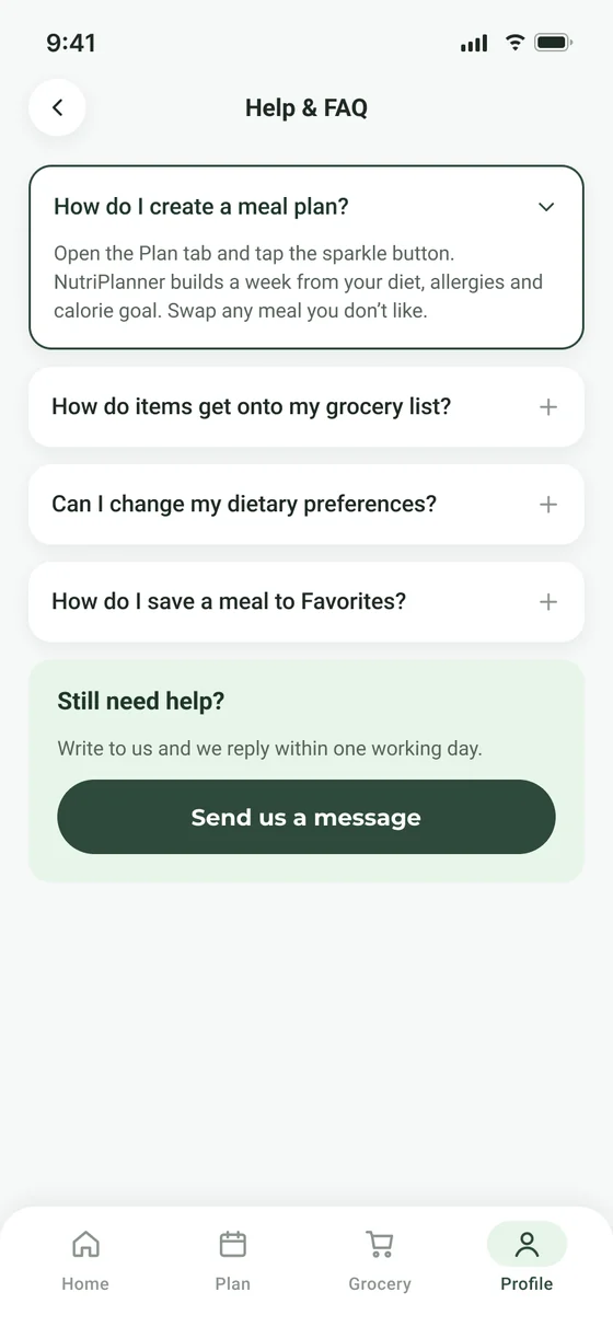
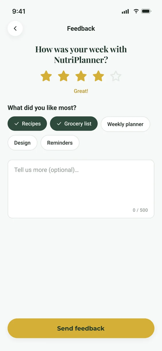
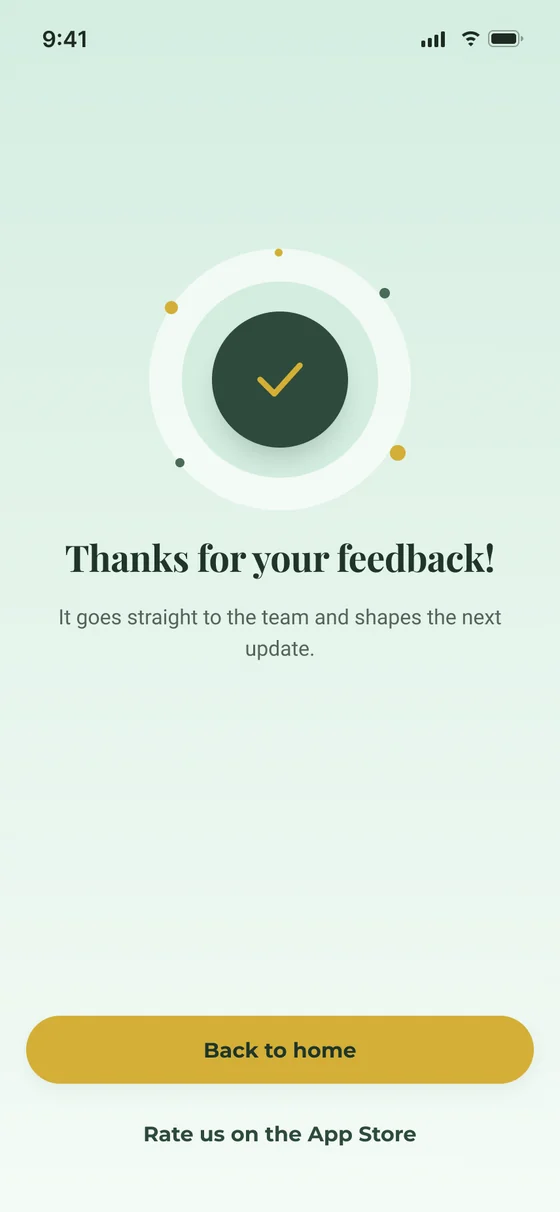
Seventeen screens, one flow.
From the splash screen to feedback. Scroll sideways to see them all.
06 · Try it
Tap through the real prototype.
57 interactions: the splash screen moves on by itself, buttons, tabs and back arrows all work. It runs inside Figma, right here on the page.
Open in Figma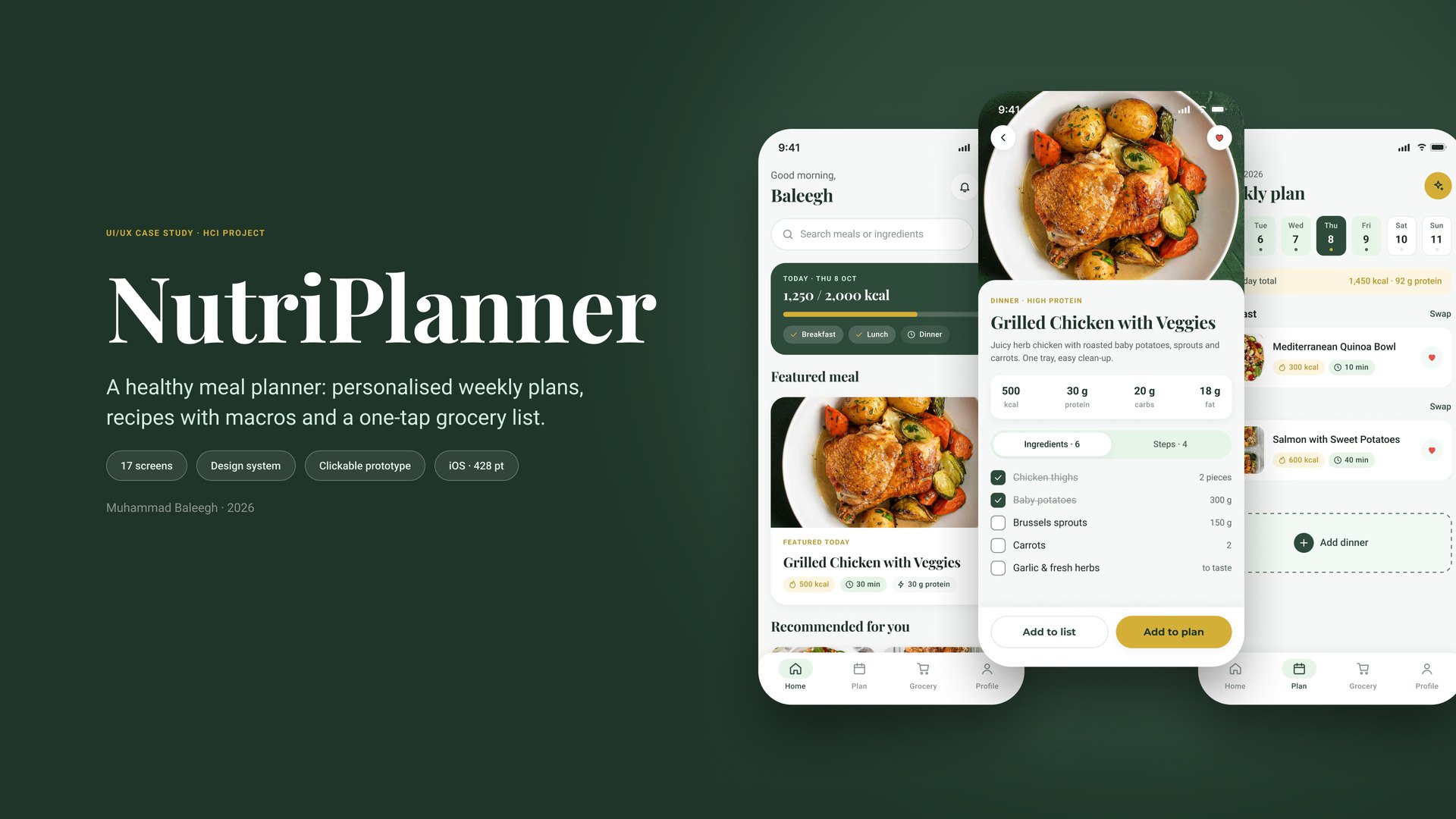
Loads Figma’s player (about 5 MB).
07 · What I learned
- Systems first, screens second.Building tokens and components before screens made 17 screens consistent and fast to change.
- Measure accessibility.The gold buttons “looked fine” but failed. Calculating contrast changed one colour and fixed every button at once.
- Show the flow, not just screens.Wiring the prototype exposed the missing sign-up and preferences steps.
Thanks for reading.
See all projects