Muhammad Baleegh ÖSTER

UI/UX case study · Figma · 2026

ÖSTER

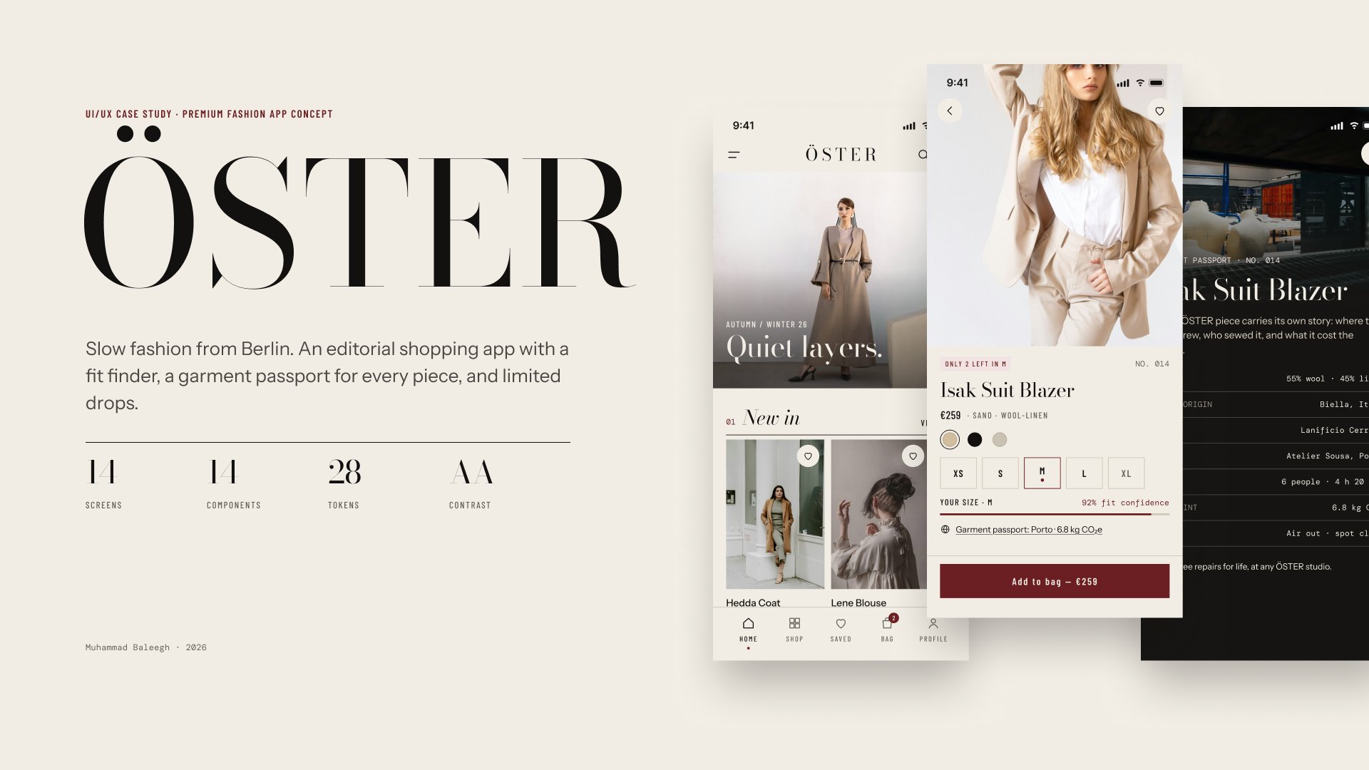
Slow fashion from Berlin. An editorial shopping app with limited drops, a fit finder and a garment passport for every piece. Buy less, buy better.

Role
Brand, UI/UX design, design system, prototyping, film
Tools
Figma: variables, components, auto-layout, prototyping, motion
Scope
iOS app, 14 screens, 390 × 844
Context
Self-initiated concept project, not a real brand

A film in eight parts, animated in Figma. 50 seconds, sound on. The 9 : 16 cut is made for Reels and Stories.

01 · The brief

Most fashion apps say buy more. ÖSTER says buy better.

Shopping apps are built for volume: endless feeds, flash sales, free returns. The result is clothes that are bought fast and worn a few times, and a lot of them are sent back because they do not fit.

ÖSTER is an imagined Berlin label that makes small runs of well-made pieces. The app had to feel like a fashion magazine, not a shop template, and solve two real problems: fit and trust.

02 · Four ideas

Four ideas carry the whole product.

Each one is a design decision, not a decoration. Together they slow shopping down without making it harder.

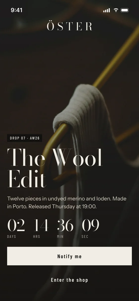
Drop countdown screen: The Wool Edit, twelve pieces, released Thursday at 19:00, with a live countdown and a Notify me button

01 · Limited drops

A few pieces, released on a date.

Instead of an endless catalogue, collections arrive as small numbered drops. The app opens on a countdown: twelve pieces in undyed merino and loden, Thursday at 19:00. Scarcity is honest here: it is how a small atelier really works.
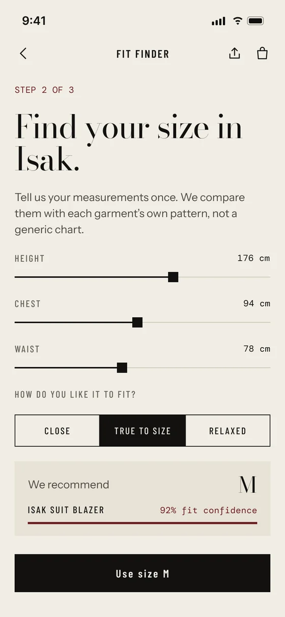
Fit finder screen: height 176 cm, chest 94 cm, waist 78 cm, preference true to size, recommendation size M with 92% fit confidence

02 · Fit finder

Measure once. Fits every drop.

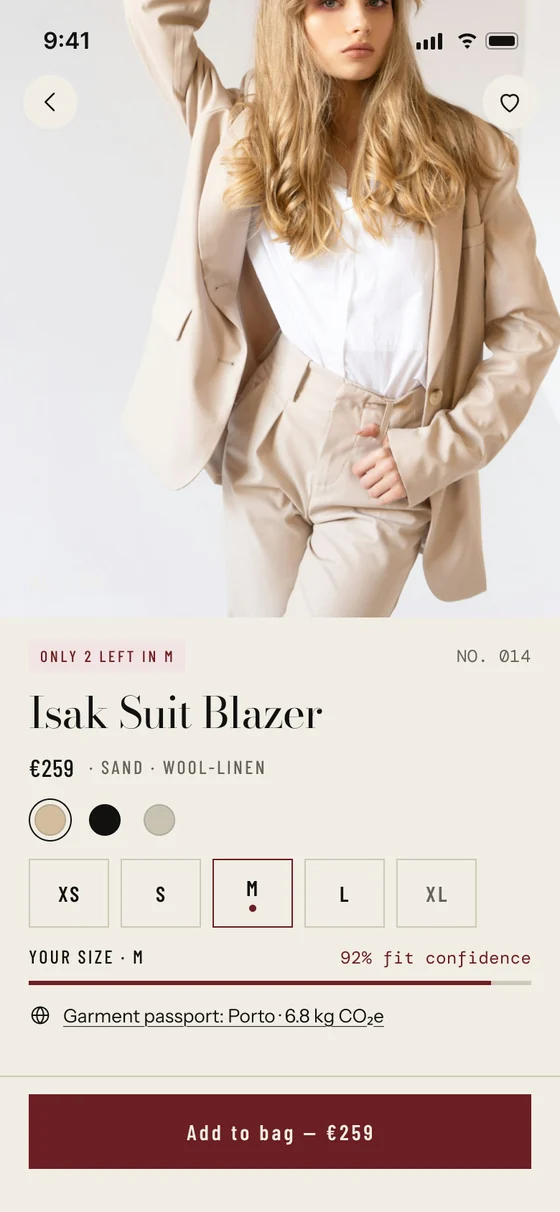
Three sliders and one question. Your measurements are compared with each garment’s own pattern, not a generic size chart, and the app answers with a size and a confidence score. The same score comes back on every product page.

  • Height176 cm
  • Chest94 cm
  • Waist78 cm
  • ResultM · 92 %
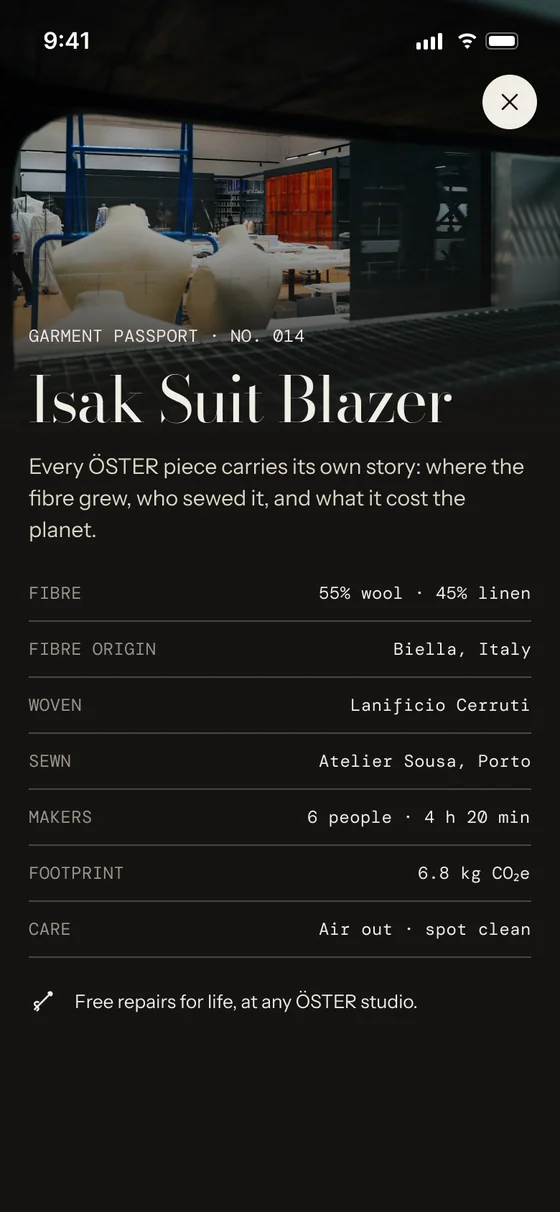
Garment passport screen for the Isak Suit Blazer, number 014: fibre, origin, mill, atelier, makers, footprint and care

03 · Garment passport

Every piece has a passport.

Where the fibre grew, which mill wove it, who sewed it, how long it took and what it cost the planet. Set in DM Mono, the data reads like a garment label, so sustainability becomes part of the product, not small print.

  • Fibre55 % wool · 45 % linen
  • SewnAtelier Sousa, Porto
  • Makers6 people · 4 h 20 min
  • Footprint6.8 kg CO₂e
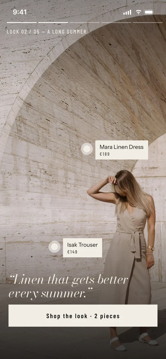
Lookbook screen: a full-bleed editorial photo with tappable tags for the Mara Linen Dress and Isak Trouser, and a Shop the look button

04 · Shoppable lookbook

Browse it like a magazine. Shop it like a store.

Full-bleed editorial stories with tags on each piece. One tap shows the price, one more adds the whole look to the bag. Commerce sits quietly inside the story instead of interrupting it.

03 · The design system

A fashion magazine, not a shop template.

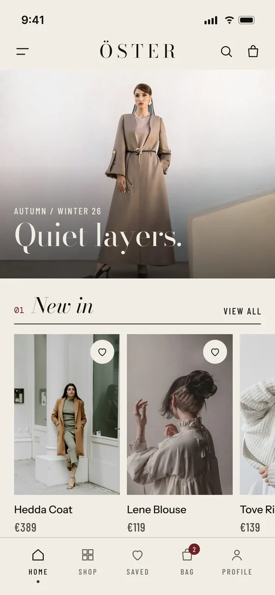
Bone paper and ink carry the brand. Oxblood appears once per screen, only for the commerce action or something that needs attention. Corners are square, photos run edge to edge.

Every colour and spacing value is a Figma variable, and every screen is assembled from components with variants.

Paper#F1EDE4
Paper 2#E8E2D6
Ink#121110
Ink 3#67615A
Oxblood#6B1E22
Success#3E5A44
  • Ink on paper16.1 : 1
  • Paper on oxblood9.8 : 1
  • Ink 3 on paper5.2 : 1
  • Ink 3 dark on night6.1 : 1
  • Every text pair passes WCAG AA

The Wool Edit

Bodoni ModaDisplay. The editorial voice.

New in

Bodoni Moda ItalicSection titles and quotes.

Your size · M   €259

Barlow CondensedTracked caps for labels, prices, buttons.

Made in Porto, released Thursday.

Instrument SansCalm body copy.

6.8 kg CO₂e

DM MonoProduct data, like a garment label.

Button variants: primary ink, commerce oxblood, outline and text
Button · 4 variants
Input field in default, focused and error states
Input · default, focus, error
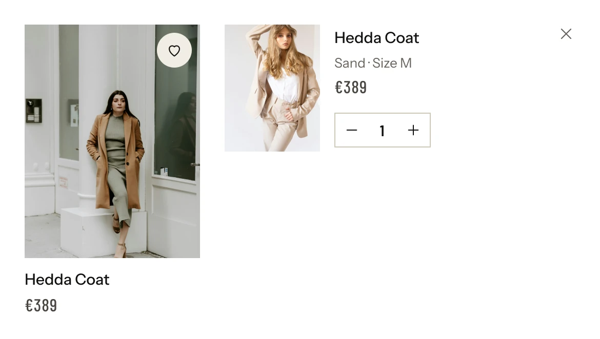
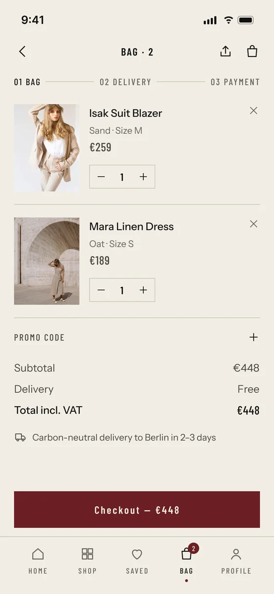
Product card in grid and bag-row variants
Product card · grid, bag row
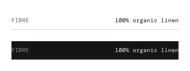
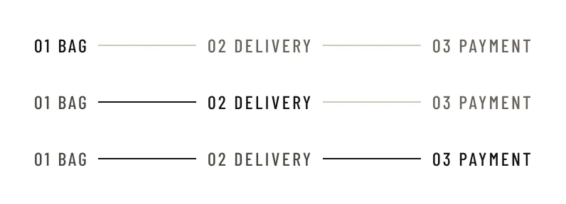
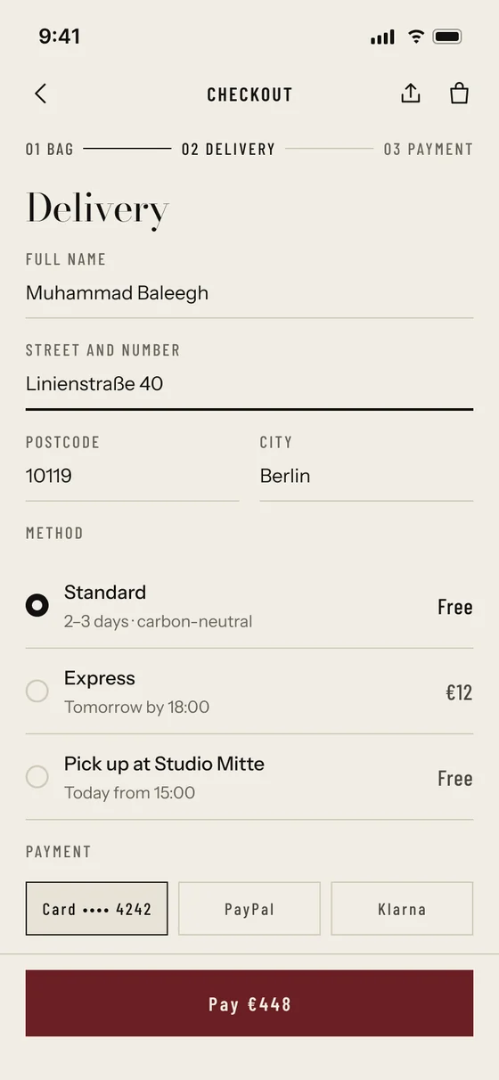
Passport line in light and dark variants Checkout steps: bag, delivery, payment
Passport line · checkout steps
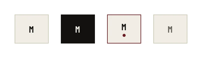
Size chip in default, selected, recommended and disabled states
Size chip · 4 states
Fit confidence bar, your size M, 92% fit confidence
Fit confidence
22 line icons on a 24 pixel grid with a 1.5 pixel stroke
Icons · 24 px · 1.5 stroke

04 · The screens

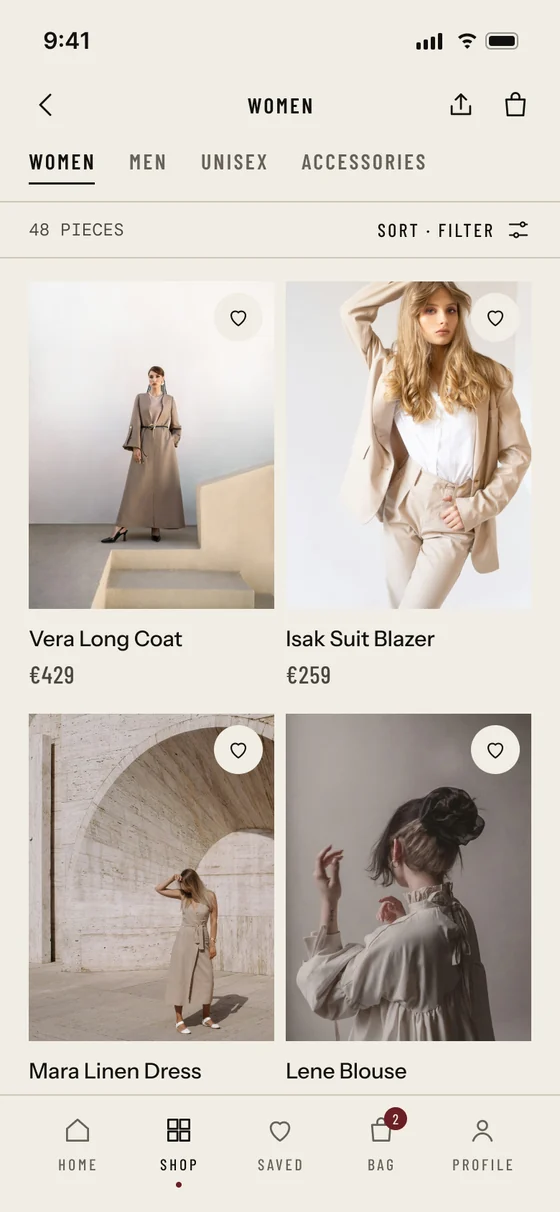
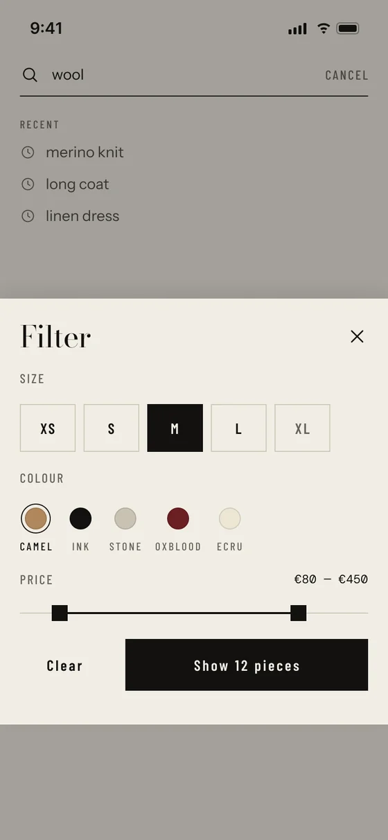
Fourteen screens, from drop to doorstep.

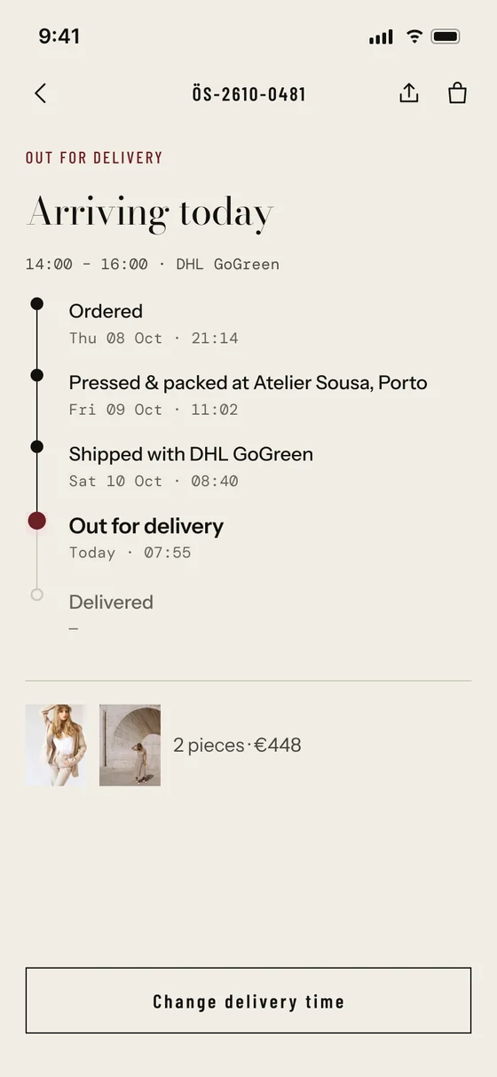
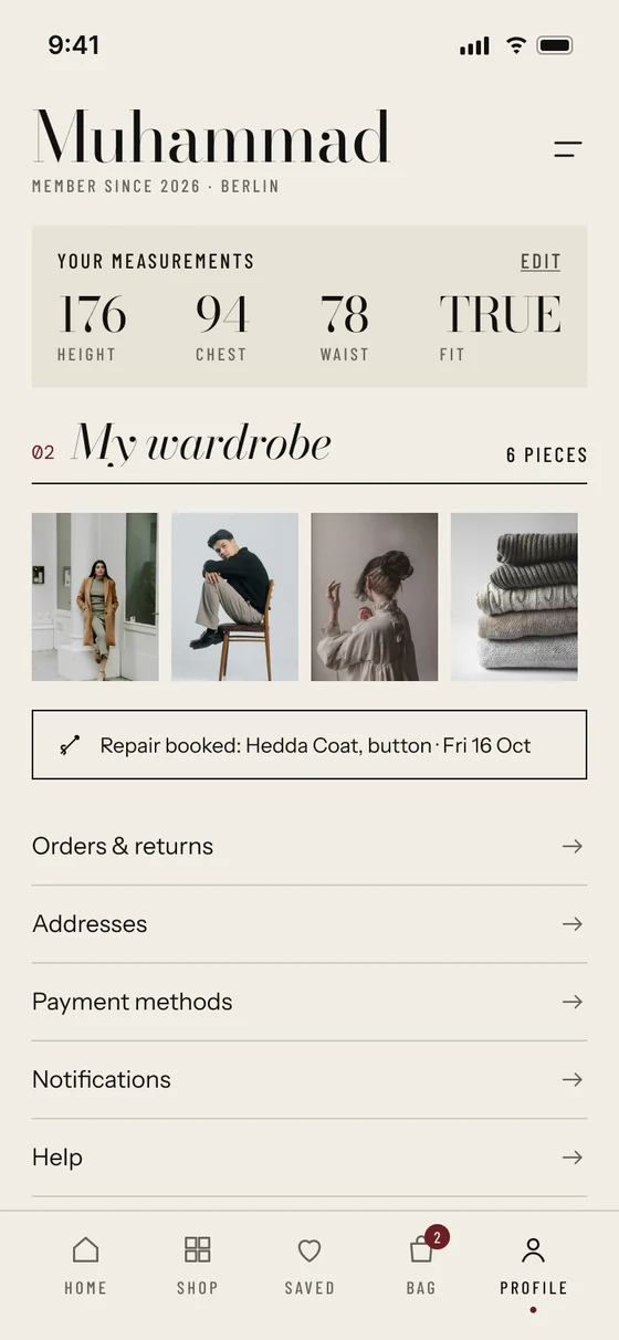
Countdown, browsing, fit, passport, bag, checkout, tracking and profile. Scroll sideways to see them all.

05 · Try it

Tap through the real prototype.

60 interactions in two flows: from the drop countdown all the way to a confirmed order, or straight into shopping from the home screen. It runs inside Figma, right here on the page.

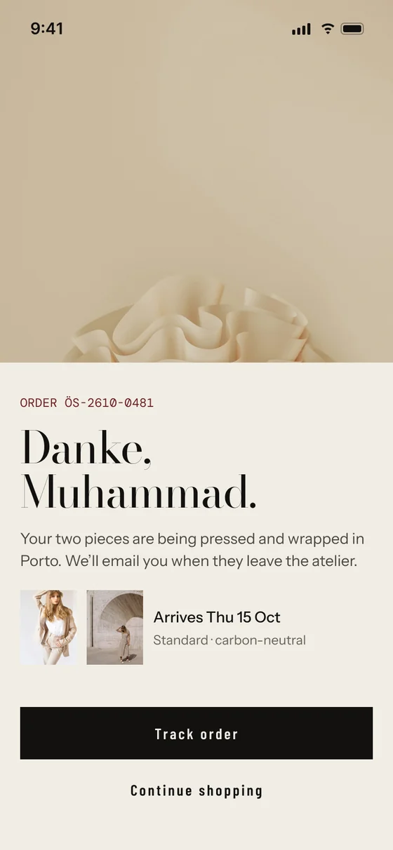
ÖSTER app screens

Loads Figma’s player (about 5 MB).

06 · What I learned

  1. Restraint is a system.Allowing oxblood only once per screen made every commerce action obvious without a single loud colour.
  2. Measure, don’t guess.The first warm grey looked fine but failed AA on paper. Darkening it to #67615A fixed every caption at once through one variable.
  3. Data can be beautiful.Setting fit and footprint numbers in a mono “label” style turned them from small print into a reason to buy.

Thanks for reading.

See all projects